Zerno
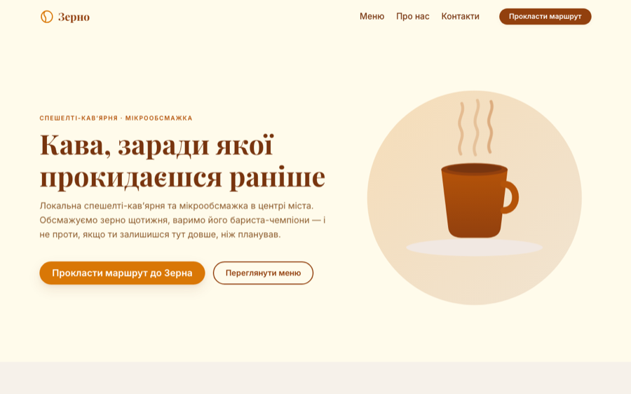
A one-page site for a coffee shop, built end to end — copy, illustrations, layout, code — to show exactly what the “landing page” option on this site actually delivers.
- My role
- Copy, design, illustration, code
- Size
- 1,000 lines, one file
- Stack
- HTML, CSS, vanilla JS — no framework
- Status
- Live demo
First, what this is not
Zerno is not a real client. The coffee shop, the brand, the roast dates and the street address are invented. I built it because a price list is an abstraction — “landing page, from €400, one to two weeks” tells a business owner almost nothing about what arrives at the end of those two weeks.
So this is the answer in full size: a complete site rather than a mockup, with everything a real order includes, and nothing borrowed from a template.
The copy came before the layout
The text was written first, as a separate document, and only then laid out. That order is not a preference — it decides the outcome.
Design that starts from a layout ends up with text poured in to fit the boxes, and the boxes were chosen because they looked balanced. Design that starts from the copy puts the boxes where the argument needs them. A visitor arrives with a question — why here and not the place across the road? — and the page has to answer it in the order they think, not in the order the grid suggests.
The copy document ships with the project as its own deliverable, headline options included. The client keeps the words, not just the pixels.
A landing page with no images at all
There is not one <img> on the page. Every illustration — twelve of them — is drawn directly in the markup as vector graphics.
That is not a technical flourish, it is what makes the page fast on a phone:
- Nothing to download and wait for. The page arrives in a single request; there is no second wave of image loading after the text appears.
- Nothing jumps. Photos that arrive late shove the layout around under the reader's thumb. Vectors are already there when the text is.
- Sharp on every screen. No blurring on a retina display, no separate sizes to export and maintain.
- Nobody else's photos. Drawn artwork costs no licence, matches the brand palette exactly, and cannot turn up on a competitor's site next month.
Most landing pages are slow for one boring reason: photographs. Removing them entirely is not always possible — a restaurant does need pictures of the food — but it is worth asking which images are actually earning their weight.
The order of the page
Hero with the offer and a route to the door → why here rather than elsewhere → the menu with real prices → other people's words → a closing call with the address and opening hours. Nothing surprising, and that is the point: it follows the sequence in which a person decides, and the address is repeated at the end because that is where the decision is actually made.
Colours, spacing and typography come from named design tokens set once at the top of the file. A client asking for “a warmer brown” is one value, not a search across a thousand lines.
What I would change for a paying client
- Self-hosted fonts. The demo pulls its fonts from Google, which costs an extra connection to another server before any text can render. The portfolio you are reading now serves its own fonts, and a real project would too.
- A booking or contact form. The demo sends visitors to the address and the phone. A working coffee shop would want a table booking, and that also means anti-spam handling and a privacy policy.
- Real content. Invented prices and roast dates are the easy part to replace, and the part that has to be right — everything else on the page is only as convincing as the facts on it.
The site is in Ukrainian — it was written for a Ukrainian coffee shop.